JIMMIE DURHAM

Posted on 2013-10-28

The choice of Brussels for the opening of a second space was motivated by longstanding friendships, close relationships with collectors, museum directors and artists but is also linked to the development over the past years of the Belgian art scene and more particularly that of Brussels’s. The gallery will have the pleasure to initially present its European and American artists and to offer the opportunity for Belgian artists to use its space.

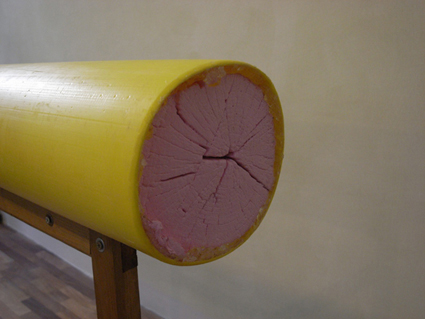
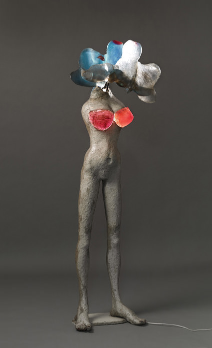
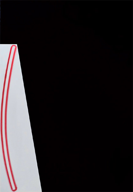
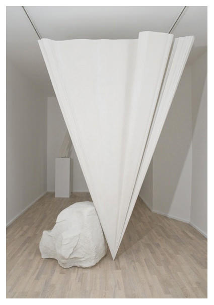
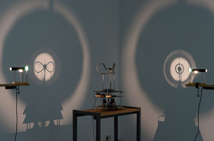
The sculptures and drawings that Jimmie Durham offers us provoke in us a desire for dialogue(s). Dialogues with banal objects, which are common or even neglected but unconsciously carry a story and/or a political reality close to that of the artist, unperceived at the first glance.
In fact, the works of Jimmie Durham are indefinable, cannot be categorised and carry on a conversation about their identity, their story, their “life.” The artist invites the objects he has found, for example, on long walks with his family and to his studio, plays with them before sending them back into the world in a new way.

Jimmie Durham tells us, “I would like to make art each individual thing there is, there would not be a time when you had to decide to keep it or throw it away. It seems to me one can do that sort of non-dictatorial thing by making things which don’t have to do with craftwork at all just intellectually join our normal physical world.”

Exhibition runs through to December 7th, 2013

Galerie Michel Rein Brussels
51A Washington Street
B-1050 Brussels
Belgium

michelrein.com


ALINA SZAPOCZNIKOW

Posted on 2013-10-28

The basic principle, the Tartuffe principle, we can call it (Molière’s Tartuffe, but not only), endures through the ages and across cultures (Femens in every land, the job has still to be done!): “Cover that breast I cannot bear to see!” Sex, as we know, has a bad reputation.

When explicit it is terrible, dirty or nasty! So leave it to the pornographer and his vile deeds! When more suggestive, half-hearted (or through pursed lips, so to speak), it fares better with the upholders of good taste, but then of course it butters no parsnips. Not that artists have refrained from representing it, and sometimes in the most brutal fashion (from Courbet to Nauman, via Picasso, Man Ray, Molinier, Louise Bourgeois or Lebel), with or without “delectation” for the beholder, as Duchamp used to say. But clearly, like an artistic equivalent of the top shelf, it is clear that these pieces are “curiosities,” minor works even when major-format. Fémininmasculin, the exhibition conceived for the Pompidou Centre fifteen years ago by Marie-Laure Bernadac and Bernard Marcadé, showed, however, that sex was neither secondary nor scabrous, but intimately bound up (excuse the expression!) with the process of art itself.

That in fact it expressed more than it revealed through forms whose representation in itself is pretty much an open and shut case: that it cast light on creation from within, we might say. At the time, I regretted and was above all astonished that Alina Szapocznikow did not feature in what was and remains a milestone in the French approach to “gender.”

Exhibition runs through to December 7th, 2013

Galerie Loevenbruck
6, rue Jacques Callot
F – 75006 Paris
France

www.loevenbruck.com


JOSÉ LOUREIRO – OURIÇOS

Posted on 2013-10-21

“Today, I limited myself to a single, wide and long red brushstroke. A workload only akin to the twelve Labors of Hercules. These brushstrokes bring to mind big ships with excess weight at the bow, risking sinking as soon as they set sail but finally managing to go their way.” I wrote these lines in a recent (and lengthier) email to a friend of mine, telling him about what I was doing. If I start by quoting my own words it is because they accurately describe the way I’m now working.

Each one of these brushstrokes arises from a particular place, different from all others, and the dimension they acquire essentially depends on the ballast of pigment and oil they carry within. Black is important because it behaves as a catalyst; for example, as it tangentially approaches a red, it intensifies it, rendering it redder. This red – I could have used any other color in this example – is more intense at its center and diffuse at its margins, almost forming a halo. Apparently immobile, these colors fluctuate and never really touch each other, even when they overlap.

Color and brushstroke are a single entity, inextricable. As such, there is time and duration, beginning and end. It is between these two points, and in a scale ranging from disaster to epiphany, that everything is played out. Colors are served in tubes we can buy at the store. We open one of these tubes and become ecstatic with what we see. Only later we understand that colors are like sharp ramparts, so closed in upon themselves that they can only be taken by storm, and with immense effort. We don’t even have exact names for them; despite the fact that they’re always so impeccably labeled. Having one color, we just need to change its place so that it’s no longer the same. Colors communicate between them in an indecipherable code, impervious to the most powerful algorithm. They are as slippery as eels, and sting like urchins. We’ll never discover the Rosetta Stone of colors.

José Loureiro

Exhibition runs through to November 13th, 2013

Cristina Guerra Contemporary Art
Rua Santo António à Estrela, 33
1350-291 Lisbon
Portugal

www.cristinaguerra.com


NICK HORNBY – SCULPTURE (1504-2013)

Posted on 2013-10-21

In The Present Is Just a Point, Michelangelo’s David has been extruded to a single point. Standing 9-ft tall and made from half a ton of 150-micron marble dust, the apotheosis of human perfection is reduced to zero, the impeccable curves and relaxed contrapposto of David stretched to their endpoint. The horizontal extrusion is stood erect balancing on its tip, supported by a boulder in the same way historic figures are braced by adjacent rocks or conveniently placed tree trunks. In an inversion of the process of carving (removing) to a gesture of modeling (adding), Hornby commissioned a traditional stone carver from Carrera, Italy, to come to London and model a rock in terracotta at his studio.

David’s face appears in a second work, this time mirrored upon itself at a degree angle to make a new compound face. The result is an anamorphosis, the face skewed so severely that it is recognizable only from an acute angle. This Pinocchioesque head is suspended in a bronze cage, much like that of Giacometti’s Nose. In both the resin and bronze versions, the profile becomes an unsettling moment of aggression, not quite the gun-shaped sculpture of Giacometti, but a startling disfiguration of beauty.

Finally, Hornby departs from his more typical gleaming white curves with nine photographs. Hornby has digitally manipulated Matisse’s The Backs (1909-31) in order to extrapolate hypothetical future iterations beyond Matisse’s works, themselves a progression further and further into abstraction as the modeling of flesh gave way to geometric forms. In Hornby’s simplification, the relationship between figure and ground, already at stake in Matisse’s production, falls away, and the compromised forms collapse not into difference but repetition. Unlike the exclamation point of The Present Is Just a Point, the grammatical comparison here would be the ellipses, a subtle fade to black. The trickster makes this world.

Exhibition runs through to November 2nd, 2013

Churner and Churner
205 10th Ave
New York
NY
10011

www.gregorpodnar.com


ATTILA CSÖRGÕ – SHAPES IN TRANSITION

Posted on 2013-10-21

Combining the media of photography, sculpture, and drawing, the works of Hungarian-born artist Attila Csörgõ offer viewers an intelligent and playful introduction to questions of science and technology. The results are often unexpected, amusing, or even poetic. In long-term experiments the artist explores branches of science such as kinetics, optics, or geometry to examine questions of perception; and on this basis he develops his theories about the construction of reality.

Recent kinetic constructions of the experimental Clock-work series, Clock-work from 2011 and Clockwork (Made in Poland) from 2012, continue his examination of light and motion combined. At the interface of visual arts and science, his work on phenomena of perception finds its focus in the lemniscate, the figure eight lying on its side. Both mathematical symbol and poetic shape, the lemniscate is a symbol of infinity shaped like a horizontal 8. What Csörgõ has built is a ‘time machine’ which can be read as a sculpture or a three dimensional drawing, a moving picture or simply a scientific experiment.

‘Squaring the circle’ was originally one of the famous – unsolvable – mathematical tasks coming from the ancient Greek world. It fascinated people during centuries until the final conclusion in the 19th century when mathematicians proved it is unsolvable. Nowadays, metaphorically, we use this phrase for describing a task that is impossible to carry out.

Exhibition runs through to October 26th, 2013

Galerija Gregor Podnar
Lindenstrasse 35
D-10969 Berlin
Germany

www.gregorpodnar.com


RICHARD PRINCE – PROTEST PAINTINGS

Posted on 2013-10-14

Painted on a vertical canvas in the shape of a protest placard, the Protest Paintings alternate between monochromatic minimalism and richly layered colourful abstraction. Incorporating recycled jokes, printed and hand-written, as well as mined pattern details silkscreened onto the canvas, these paintings are characteristic of Prince’s tenet of appropriation. A mainstay in his oeuvre, the classic one-liners offer comic respite, whilst also challenging the antipathy between high and low art. Masking a menacing truth behind a veil of humour, the jokes are subversive in their purpose.

Purposefully ambiguous, the scrawled slogans resist interpretation, enacting their very own protest through language. Refusing to conform to the standards of the art value system, the Protest Paintings seemingly channel the spirit of the 1960’s counterculture, a defining era to which Prince bore witness.

Featuring paintings from public and private collections, the exhibition demonstrates the breadth of Prince’s creativity in this singular body of work. The range of paintings on show includes monochrome canvases with printed and handwritten jokes, patterned canvases with block text and brightly coloured abstract compositions overlaid with graffiti and drip marks.

In contrast to the formulaic design of the earlier Monochrome Joke paintings, in the Protest Paintings we see Prince’s full creative involvement. Carefully assembling different segments of canvas to form the symbolic crossbow shape of the protest placard, Prince combines gestural brushstrokes with under-painting, silkscreen and disjointed signs, to create a palimpsest of art historical reference and his own particular brand of humour. A visual expression of the performativity that is both characteristic of a protest and a constant element throughout Prince’s oeuvre, the Protest Paintings are a masterful example of Prince’s unique artistic practice.

Opposite – Untitled (Protest Painting), 1994

Exhibition runs through to December 20th, 2013

Skarstedt Gallery
23 Old Bond Street
London
W1S 4PZ

www.skarstedt.com