JOHN ALTOON

Posted on 2014-06-16

John Altoon is the first major retrospective devoted to this little-known yet important artist whose brief but significant career unfolded in southern California from the 1950s until his untimely death in 1969 at age 43. The exhibition includes approximately 70 paintings and drawings from public and private collections across the United States.

Trained as a commercial illustrator as well as a fine artist, Altoon developed both an abstract vocabulary influenced by Abstract Expressionism and a figurative style (often erotically charged and with socio-political content) that reflected his commercial background. He also developed a hybrid style combining abstraction with figuration.

Opposite – Untitled, 1964, from the Hyperion Series

Exhibition runs through to September 14th, 2014

Los Angeles County Museum of Art
5905 Wilshire Blvd
Los Angeles
CA 90036

www.lacma.org


BRIDGET RILEY – THE STRIPE PAINTINGS 1961-2014

Posted on 2014-06-13

The exhibition features paintings and studies selected from all periods of her career, from 1961 to 2014, the show will be installed throughout the three floors of the gallery, making it the artist’s first major survey in London since her 2003 retrospective at Tate Britain.

“Bridget Riley is undoubtedly one of the world’s most significant living artists and her influence on present and future generations cannot be underestimated,” says David Zwirner. “I am honoured to be able to show such a definitive selection of her stripe work in my London gallery.”

Riley’s dedication to the interaction of form and colour has led to a continued exploration of perception. From the early 1960s, she has used elementary shapes such as lines, circles, curves, and squares to create visual experiences that actively engage the viewer, at times triggering optical sensations of vibration and movement. Focusing on her recurrent use of stripes over the past fifty years, the exhibition demonstrates the visual variety she achieves by changes in colour, weight, rhythm, and density. Opening with an iconic black-and-white, horizontal stripe painting from 1961, the show includes her first stripe works in colour from later that decade, as well as a large two-panel diagonal stripe painting, Prairie (1971/2003), and vertical stripe works from the 1980s that demonstrate her “Egyptian” palette. The survey finishes with the artist’s newest body of horizontal stripes, including several paintings that have never been exhibited before. Works on paper related to the paintings are also on view.

Opposite – Après Midi, 1981

Exhibition runs through to July 25th, 2014

David Zwirner
24 Grafton Street
London
W1S 4EZ

www.davidzwirner.com


GIL HEITOR CORTESÃO

Posted on 2014-06-11

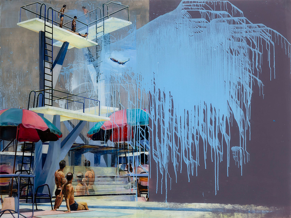
Gil Heitor Cortesão has been interested in swimming pools for a long time – in the case of his works, at least since 2002 – as well as houses and interiors, both public and private. One can also state that the situations represented in his works tend towards the liquid state; that is, it is as if reality is subjugated to the painting itself and the latter ended up by contaminating it until its irremediable corrosion. Due to all this it perhaps may not be an exaggeration to state that this is a work about the end of the times, and is therefore eschatological. The way he applies the paint on the surface of each work – allowing it to run, using it to form stains, or also using it to create areas of great chromatic turbulence – reinforces the idea that the image represented is about to disappear, such is the feeling of dizziness transmitted by this aqueous dimension.

Gil Heitor Cortesão’s choice not to paint on canvas, wood or any other surface more usually chosen by the artists who work in the same medium, but rather to prefer to use acrylic, a transparent material, also allows him to reinforce the liquid dimension that emerges from his works. That which the spectator sees is almost always an image painted from behind the acrylic: the outer part, that which is closest to the observer, has never been touched by the paint, and this latter, under normal circumstances, will never be touched by the public, as it is protected by that membrane that is simultaneously transparent and opaque, front and back, beginning and end of each instant represented there. Francis Bacon’s idea to place glass in front of his paintings, a manner of simultaneously distancing the spectator from and bringing them close to the work, may here be called up, as, in the case of Gil Heitor Cortesão, his option for acrylic seems to have more to do with his desire to question the status of the image itself and its intention to set itself up as absolute truth – hence the fact that his representations are on the edge of decomposition, as if it were no longer possible to extract anything else from them other than the sight of their implosion.

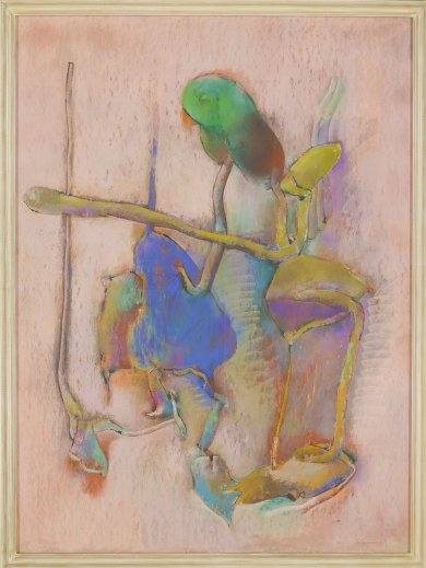
Opposite – Lost Summer 1, 2013

Exhibition runs through to July 26th, 2014

Galeria Pedro Cera
Rua do Patrocínio, 67 E
1350-229 Lisbon
Portugal

www.pedrocera.com


BRENDAN FOWLER & MATTHEW CHAMBERS

Posted on 2014-06-11

Brendan Fowler’s gradual transition from the indie music scene to the art world reveals various experiments in breaking the rules of the newfound realm whose properties he seeks to tame. Seen from afar, the works in the exhibition look like segments of photographs gone wrong. The densely arrayed rows of threads, into which the image resolves itself on closer inspection, disclose the work’s means of production – an industrial embroidery machine. The shock of the encounter with the works stems in large part from their scale. Under Fowler’s directions the mechanical embroidery becomes a mechanism for the detailed production of an all-encompassing picture. Yet, Fowler undermines against the picture’s completeness at two levels: actively, before production, when he edits the images in Photoshop, and later on, more passively and randomly, through the production flaws of the industrial machine.

For years, Matthew Chambers’ abstract works were an inseparable part of a feverish practice of figurative painting. In a work routine involving dozens of canvases in parallel, the abstract works showed up as the destination for the paintings in which Chambers identified an overburdening: he would cut these up into strips and begin a course of assembly according to a geometrical pattern. In the past two years Chambers began to experiment more and more with the geometrical arrays, and gradually the abstract works have become an independent body of work, no longer dependent on the destruction of his figurative paintings. Out of the sequence of works in the exhibition, we witness two different modes of confronting the canvas: one seeks to contend with the unceasing flow of vacuous images from the outside world, while the other turns assiduously to realms of mathematical order and logic.

Opposite – Matthew Chambers, The Only Thing I Do Energetically Is What I Want to Do, 2013

Exhibition runs through to July 26th, 2014

Hezi Cohen Gallery
54 Wolfson Street
66042 Tel Aviv
Israel

www.hezicohengallery.com


OPENNESS AND CLARITY

Posted on 2014-06-11

Openness and Clarity: Color Field Works from the 1960s and 1970s, is curated by Hayden Dunbar, the show will include works by Josef Albers, Anthony Caro, Helen Frankenthaler, Morris Louis, Robert Motherwell, Kenneth Noland, Jules Olitski, and Frank Stella.

Openness and Clarity pays tribute to the legacy of Color Field artists who paved the way for Minimalism, Conceptual, and Pop art, creating an enduring shift in the course of art history that can still be seen today.

Exhibition runs through to August 2nd, 2014

Honor Fraser Gallery
2622 S La Cienega Blvd
Los Angeles
CA 90034

www.honorfraser.com


ROOM&BOOK- ICA ART BOOK FAIR

Posted on 2014-06-04

Room&Book is a three day art book fair, presented in association with Claire de Rouen Books. Under one roof, visitors will be able to engage with zine aficionados, legendary specialists, magazine experts, and artist book connoisseurs – in what promises to be a unique gathering of the best specialist bookshops and dealers in the UK – both young and long-established. Highlighting contemporary approaches to book design, a number of artists will also present their own works including Christian Flamm. Works on sale will start from £10 and visitors will be able to browse publications from a range of themes including art, photography, fashion and design.

Room&Book is the first art book fair in London to focus exclusively on the role of the book dealer. There will be 18 dealers at Room&Book, and each will present a collection of iconic publications from the last 30 years, alongside their vision for more in-print titles that will become the ‘new rare’.

Room&Book art book fair runs June 6th through to June 8th, 2014

Institute of Contemporary Arts
The Mall
London
SW1Y 5AH

www.ica.org.uk