SIMON PERITON – CELESTIAL AGRICULTURE
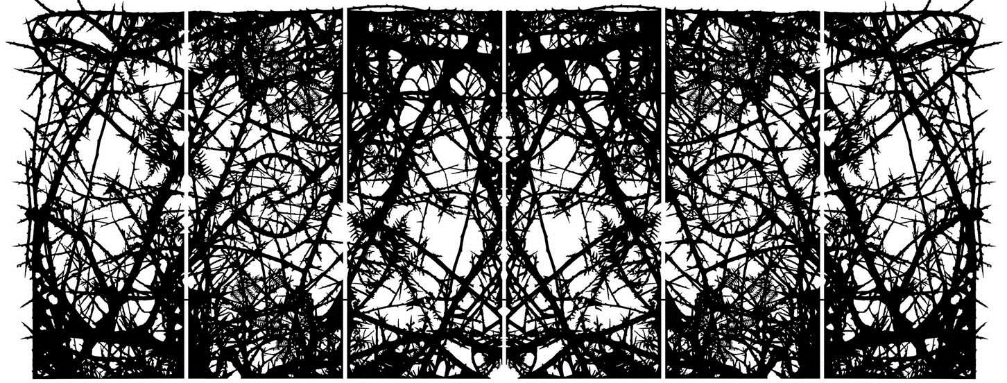
Posted on 2015-03-30

This is Simon Periton’s first exhibition at the New Art Centre and will include new objects and glass paintings inside the gallery and a specially-commissioned sculpture in the park. Periton’s more sculptural work has an intricacy and formal directness, whilst his paintings tend to be more visually ambiguous; dark, gothic and sometimes psychedelic. He is well known for his use of signs, symbols and patterns from sources as diverse as occultism, colonialism, Islam, punk, Pop Art and politics, but the prettiness of his work belies the seriousness of his cultural references just as his use of pattern often obscures his subject matter. On closer examination, even something dainty can be a veil for something more disturbing and what initially seems like mere decoration actually reveals questions about outmoded value systems and the desire for effective means of change.

Exhibition runs through to May 17th, 2015

New Art Centre
Roche Court
East Winterslow
Salisbury, Wiltshire
SP5 1BG

sculpture.uk.com


ROBERT KINMONT – JUMP

Posted on 2015-03-30

Kinmont maintains that to make art you have to let go of something. It is a little bit like jumping. Yet these pieces advocate a groundedness and patience evidenced in the choice and handling of the materials and in the message. From the paradoxical relationship between jumping and waiting brings an animated tension shared by all the works: a sense of complexity that belies the apparent simplicity of their subject matter.

Sixteen Dirt Roads (2015) presents the gritty substances of a finite number of roads, each subtly different in color, composition and meaning; and each beautifully housed in copper boxes that contrast absolutely with their ashen dusts. Forks (2015) sees four wooden boxes lined in a row. Three of these contain numerous cut branches, such as might be used to make a slingshot or to divine water; the other fork units are of copper piping that have been cut and soldered together to masquerade as wooden forks – an attempt that comically underlines the inherent character of materials and inimitable intricacy of the natural world. trying to understand (2015) consists of three wooden boxes with twenty-four wooden gliders tessellated inside. A super 8 movie filmed in the 1970s depicts the artist’s arduous effort at 10,000 feet to achieve a successful glider flight, contrasting with the sedentary regiments of boxed gliders.

Such works recall Minimalism through their seriality, boxed forms and use of copper while relinquishing any reckoning of the world to the wind. The natural world intervenes in Kinmont’s art, making definitions temporary and hierarchy nonsensical. Instead, as he tells it in a piece from this year, there is no place to rest for the artist – a statement in cursive copper, written forwards and back, upright and upside down that speaks of acceptance as much as of enlightenment.

Opposite – Plumb Bob, 1973/2014

Exhibition runs through to April 30th, 2015

RaebervonStenglin
Pfingstweidstrasse 23 / Welti-Furrer Areal
8005 Zürich
Switzerlan

www.raebervonstenglin.com


NICOLAS PARTY – TWO NAKED WOMEN

Posted on 2015-03-30

For this exhibition the Swiss born, Brussels based artist will respond to the dual structure of the gallery, taking it as an opportunity to explore the shape-shifting physicality of color: two large-scale black and white charcoal wall drawings presenting classical nudes of women will be drawn on the end walls of the gallery, creating a link between the two spaces and a striking formal contrast to the vividly-coloured landscapes pastels on the side walls.

From the pastel on canvas to the charcoal wall drawings, the visitor will experience a journey from the liveliness of colorsto the most primal of mark-making materials. Charcoal’s primary nature will create an immediate, tactile connection with the wall’s surface, that provides the ground for a sort of trompe-l’œil illusion. The show at kaufmann repetto will also feature a series of new pastels depicting imaginary landscapes, spaced out by sculptural ceramic teapot beaks sticking out from the walls. While coffee pots and tableware are recurring subjects in Nicolas Party’s work that may recall historical painters such as Giorgio Morandi, Party’s paintings and pastels, with their often improbable proportions and unrepresentative, vivid colors, create a sense of painting as something deeply contemporary and tangible.

Opposite – Portrait, 2015

Exhibition runs through to April 20th, 2015

Kaufmann Repetto
Via di porta Tenaglia 7
20121 Milan
Italy

www.kaufmannrepetto.com


ANISH KAPOOR

Posted on 2015-03-23

A radical return to painting marks this new solo show by Anish Kapoor, whose work continues to evolve, seduce and challenge, more than three decades since he first exhibited at Lisson Gallery. A new group of vast, seething red and white resin and silicon paintings, emerging from an intensive process of creative exploration, dominate the main room. These can be read in distinct but overlapping registers, evoking at once the raw internal spaces of the body and the psyche; the humanist and realist painterly tradition of Rembrandt, Soutine and Bacon; and the wider cultural reality of social and political upheaval, violence and trauma.

This new body of work draws on Kapoor’s own artistic history. From his earliest days as an artist he has made two-dimensional works in ink, acrylic, gouache, oil, pigment and earth on both paper and canvas. The new paintings also recall his recent monumental mechanised installations, such as My Red Homeland (2003), Svayambh and Shooting into the Corner (both 2009), which have all employed visceral expanses of red wax; this time the painterly manipulation is wrought by an unknown force, rather than automated by machine. The contested surface of the new silicon works extends Kapoor’s interest in the legend of Marsyas, whose skin was flayed by the Greek god Apollo and whose name was used as title for the artist’s 2002 Turbine Hall commission at Tate Modern.

Exhibition runs through to May 9th, 2015

Lisson Gallery
27 Bell Street
London
NW1 5DA

www.lissongallery.com


HARUMI YAMAGUCHI – HARUMI GALS

Posted on 2015-03-23

Yamaguchi was born in Matsue in the Shimane prefecture, and graduated from Tokyo University of the Arts with a degree in oil painting. After working for the publicity department of Seibu Department Stores, Yamaguchi begun her career as a freelance illustrator, participating in the advertising production for PARCO with its opening in 1969. Since 1972 Yamaguchi has depicted female figures using airbrush techniques, instantly establishing herself as an illustrator that symbolized the era.

The encounter between Yamaguchi and PARCO was an inevitable one. Tsuji Masuda whom served as the president of PARCO had established plans for creating a department store that functioned as a cultural facility, collectively combining platforms such as museums, theater, and publishing in addition to retail, and as a result had headhunted Yamaguchi for this endeavor. As could be seen in Masuda’s decision of appointing Eiko Ishioka for the art direction, Kazuko Koike as copywriter, and Harumi Yamaguchi for the illustration, PARCO had soon focused on ‘women’ as a major driving source behind Japanese society of 1970s and onward, further succeeding in diverting this power to the business sector.
Yamaguchi’s female figures are far from notions of eroticism as portrayed allegedly through male eyes in the form of pin-ups. On the contrary, the women themselves appear to joyously celebrate their own sexuality and existence. Furthermore, the images of women partaking in boxing, baseball, and skateboarding which Yamaguchi had illustrated in the 70s, could be interpreted as an ironic gesture towards a male-dominant society at a time prior to the establishment of the Equal Employment Opportunity Act in 1985; an era when women were unable to equally advance into society.

Opposite – Basketball, 1975

Exhibition runs through to April 4th, 2015

Nanzuka
2-17-3 Shibuya Shibuya-ku
Shibuya Ibis bldg. #B1F
150-0002 Tokyo
Japan

nug.jp


CHARLINE VON HEYL

Posted on 2015-03-23

Cologne in the late 1980s was dominated by a debate about the merits and pitfalls of painting. If there was any point of agreement, it was in rejection of the mythic landscapes of Anselm Kiefer and the gestural marks of the internationally acclaimed neo-expressionists. However esoteric the arguments about painting may seem today, they helped clarify a skeptical position on painterly authenticity that was adopted by artists such as Martin Kippenberger and Albert Oehlen, friends and colleagues of von Heyl.

After studying with Joerg Immendorff in Hamburg, Charline von Heyl moved to Düsseldorf in the early 90s and worked for his studio. Düsseldorf’s geographic location gave the artist enough critical distance to ferment her own ideas away from the quagmire of the Cologne art scene. She began exhibiting her work in 1990, at Christian Nagel Galerie in Cologne. At the time, the gallery’s focus was on conceptual and contextual art. Von Heyl was its only unabashed painter. Her insistence provoked a dynamic and confrontational new dialog about painting in general and her work in particular, apart from the already established painting positions reigning in the Cologne of the eighties.

Opposite – Untitled (3/95, I), 1995

Exhibition runs through to May 2nd, 2015

Petzel Gallery
35 E 67th Street
NY 10065 New York
USA

www.petzel.com