SERGEJ JENSEN – MONEYBAGS

Posted on 2016-02-01

Since the early 2000s, Jensen has regularly included cloth bank bags in his work, which he sews together to make geometric paintings. ‘Moneybags’ is the first exhibition to focus on this motif within Jensen’s mode of production, and will also include new representational works that use bank bags as their painterly ground.

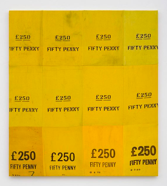
Jensen’s approach to painting is unconventional in that it can frequently involve a complete rejection of paint itself in favour of textiles – found or worn materials that reflect a history of use. In this series, Jensen limits himself to one type of basic material which is uniform in style but differs in colour, weave and size. Obtained from federal and municipal banks in Europe and the USA, the bags are occasionally branded with either the name of the bank or their original monetary contents, and represent a standardised unit as well as being a signifier of past economic value.

Jensen sews the bags into simple, grid-like compositions that take on the formal properties of geometric abstraction. In one work, for example, a number of brightly coloured bags are assembled together and then glazed over several times with dark, muted hues. Areas of the picture have then been sanded away to reveal the structural details beneath, bringing elements such as old pen marks and scribbled value information back to the surface. In another work, a grid of worn ‘Barclays Bank’ bags is painted over with champagne chalk primer to create a distressed grey monochrome.

Exhibition runs through to March 5th, 2016

White Cube Bermondsey
144 – 152 Bermondsey Street
London
SE1 3TQ

whitecube.com


ARTA – ART RAIL TRANSIT AUTHORITY

Posted on 2016-02-01

‘Doing graffiti art made me learn how to make something out of nothing, and it got me involved in the music scene. I spent time in New York exhibiting my work and appeared in Afrika Bambaataa’s feature film ‘Bombing’ as one of Britain’s top grafters.’

ARTA was simply born out of an idea Henry Chalfant and myself (Goldie) had wanted to do for years. As soon as the technology became available to build an graffiti app that feature’s everything about this culture – I jumped at the chance to do so, alongside Henry.

We need YOU now to be part of this grand vision for this cutting edge platform launch.

This summer event will be the meeting of two worlds, digital meets tangible – both in music and Graff.

www.goldie.co.uk


DEEP SUPERFICIAL PERCEPTIONS

Posted on 2016-02-01

Deep Superficial Perceptions, is a group exhibition that surveys ongoing studio explorations of material experiments in two dimensional formats. The history of image making inevitably begins with painting. This process becomes increasingly complicated as technology evolves, as perception is altered by media, beginning with the invention of photographic methods and now rapidly changing with the flow of the Internet.

Traditional art forms such as photography and painting now regularly commingle, often seamlessly, with plastic, concrete, textile, veneer, rubber, and other household and industrial materials. These complex material decisions express a love of the tactile and a nod towards ever-evolving artist experiments, such as minerals ground into linseed oil or silver salts suspended in gelatin. The artists in the show – Samantha Bittman, Julia Bland, Matias Cuevas, Alex Ebstein, Aaron Farley, Doty Glasco, Erin Morrison, and Loring Taoka – demonstrate a dedication to material formal exploration that reveals a prolonged interest in how material becomes idea.

Opposite – Aaron Farley, Sphere, 2016

Exhibition runs through till February 20th, 2016

CES Gallery
711 Mateo St.
Los Angeles
CA 90021

carlesmithgallery.com


GLEN RUBSAMEN – VISIBLE FROM SPACE

Posted on 2016-01-25

Glen Rubsamen’s craft is painting, which he treats as a traditionally established medium. Yet what appears at first glance to be traditional is at the same time the very source of Rubsamen’s subversiveness. His scenic and artistic views invariably play out against an impressive celestial backdrop that contrasts sharply and spectacularly with the silhouette-like black figures arrayed in the foreground – figures, incidentally, that cannot move; not just because they are painted, but also because they are usually things that are rooted to the spot, such as trees, antennae, and more recently, huge billboards. In spite of their immobility, they are protagonists in the sense that they narrate so much. Their narrative comes from their role serving as representatives of overarching themes. The images appear like film stills, exuding an air of calm and drama. And they all look remarkably Californian – which is still one of the classic projections of the western imagination.

Opposite – The Machine in The Garden, 2015

Exhibition runs through to March 5th, 2016

Mai 36 Galerie
Rämistrasse 37
CH-8001 Zürich
Switzerland

www.mai36.com


BENJAMIN MURPHY – GILDED CHAOS

Posted on 2016-01-25

Murphy will spend two weeks prior to the exhibition, transforming the entire gallery space with his trademark aesthetic and techniques to create a totally immersive sensory experience. Murphy has created his most labour intensive and detailed body of work especially for Beers gallery. This includes a gallery-wide installation and two-dimensional, ‘drawings’ that push the boundaries of both scale and subject matter.

Murphy is known primarily for his graphic, time-consuming installations created entirely out of black electrical tape, resulting in a stark recognisable aesthetic. This is borrowed from German expressionism, which in turn creates a subject matter that takes inspiration from Romantic literature and the history of the vanitas in art.

The artist lives in London, where he tirelessly works both in and out of studio to plan and execute elaborate tape-based drawings. Murphy’s images work on many plains of perspective and contain various contradictory elements that contain an on-going narrative or macabre. A decadent story-arc is hinted throughout, with the work referencing a range of sources mainly from poetry and classic literature, specifically creating a mystical aura around the work and allowing the spectator to create their own meaning surrounding the work.

Opposite – COSTANZA, 2015

Exhibition runs through to February 13th, 2016

Beers London
1 Baldwin Street
London
EC1V 9NU

www.beerslondon.com


JONATHAN LASKER

Posted on 2016-01-25

Lasker’s newest work continues to explore the ways in which paintings are constructed and perceived. Employing three consistent components —figure, ground, and line—Lasker’s careful arrangement of abstracted elements challenges one’s usual reaction to non-representational painting, positioning the viewer in an unexpected discourse with form and space, foreground and background, objecthood and artifice. As Lasker describes, his paintings are meant to “make the viewer see him or herself in the act of viewing,” drawing attention to “how we construct a picture in our mind.” By positioning various forms and patterns— through repetition, segmentation, and layering—to visually recede or advance in pictorial space, Lasker composes illusionary “pictures” which are at once ambiguous and decisive. Recurring figural motifs repeat throughout the paintings, acting as a sort of abstract visual vocabulary. Paralleling linguistic concepts, Lasker uses these “signs” to set up various dialogues and spatial relationships which the viewer, as if following clues, is intended to decipher. Often, a thickly rendered motif is echoed by its separate, less tactile outline; the two forms reverberate together but seem to exist on different planes, much as the missing piece of a puzzle is mimicked by its empty shape. In other works, the prominent inclusion of Lasker’s signature or initials heightens the tension between illusion and reality: dimensionality is mocked by the stubborn literalness of the painting’s two-dimensional surface.

Opposite – The End of Relevance, 2015

Exhibition runs through to February 13th, 2016

Cheim & Read
547 West 25th Street
10001 New York
USA

www.cheimread.com