AL HELD – BLACK AND WHITE PAINTINGS
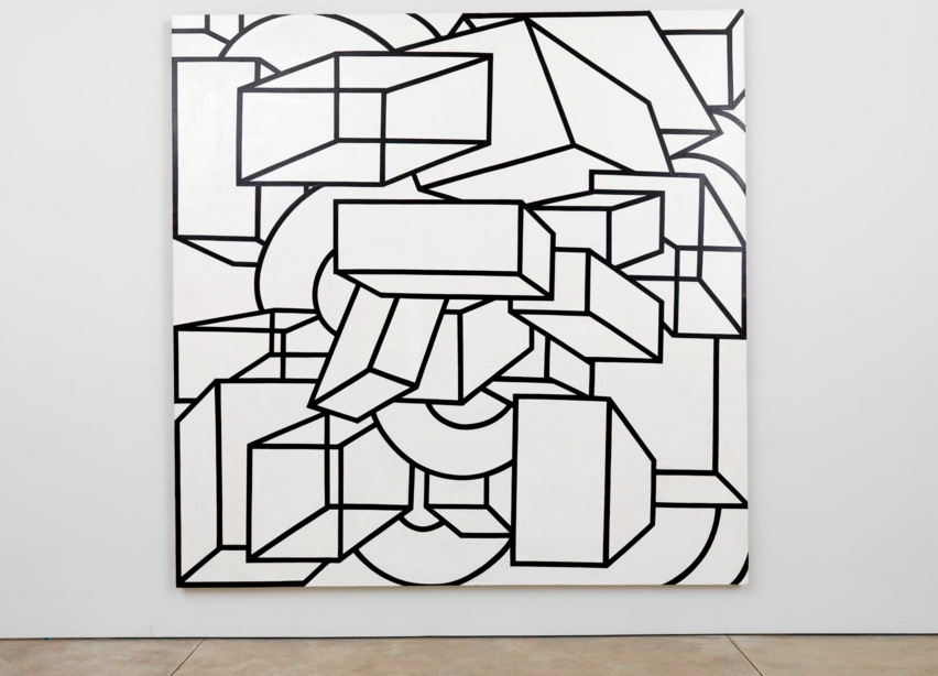
Posted on 2016-03-07

This exhibition focuses on the unique series of paintings Held began in1967, in which various geometric forms, arranged in multiple perspectives, are rendered within the strict confines of a black-and-white palette. Perhaps inspired by the India ink drawings of lines, circles, triangles, and squares that he made in 1966, Held had already begun moving away from the flat, boldly-colored shapes of his earlier work. Using charcoal and white acrylic directly on canvas, he started sketching multi-dimensional, interlocking configurations, surrounding them with colored ground. In late 1967, this experimentation yielded to an increasingly graphic, complex, and illusory space. While compositions were still worked out on the canvas, often in several iterations, Held’s soft-edged charcoal was replaced by the sharply defined contours of uniformly painted forms, their thick black outlines positioned against a stark white field.
The paintings featured in this exhibition encompass the initial phase of this new body of work. The “B/W series” is comprised of Held’s first fully realized canvases in his new style and limited palette, while works from the “Phoenicia” series are more explicit in their development of multiple perspectives and vanishing points, resulting in evermore ambiguous spatial relationships. As with his earlier work, Held painted on a monumental scale; the majority of these canvases measure over nine feet tall.

Exhibition runs through till March 26th, 2016

Cheim & Read
547 West 25th Street
10001 New York
USA

www.cheimread.com


YEHUDIT SASPORTAS – VERTICAL SWAMPS HAMAKOM

Posted on 2016-03-07

The exhibition will include a group of works on paper, the video piece The Light Workers, based 150 manual drawings, and a series of large 3 dimensional / sculptural drawings. Yehudit Sasportaas work with unusual landscape drawings which function as maps of mental data outlines. Data from her personal life become anonymous fragments of information integrated into a wider and more complex sphere. The body of work itself deals with the meeting of the physical, structural, material and the weightless, ethereal and metaphysical dimension. One dimension merging with the other is an essential part of Sasportas’ artistic attitude. The new Vertical Swamp works, created for this exhibition, consists of large drawings on wooden planks. Particles of a foreign material have penetrated and imprinted the surface of the works, representing a penetration of subconscious or foreign information from an invisible sphere into a visible. Yehudit Sasportas wishes to place the spectator in a both reflexive as well as conceptual mirror field which exposes the structure of the personal conciusness and it placement within the collective sphere.

Opposite – Cosmic Rifts #15, 2009

Exhibition runs through till March 19th, 2016

Galleri Bo Bjerggaard
Flæsketorvet 85 A
DK-1711 Copenhagen
Denmark

www.davidzwirner.com


ANNA OSTOYA – SLAYING

Posted on 2016-03-07

The original painting depicts the story of Judith, a Jewish widow who saves her people besieged by the Assyrian army. With the help of her maidservant, she plies Holofernes, the army general, with alcohol and then beheads him in his drunken state. In these new paintings, Ostoya inspects the crime scene, analyzing it through geometrical abstraction. She substitutes Judith for Holofernes, in Judith Slaying Judith, and Holofernes for Judith, in Holofernes Slaying Holofernes. Each figure attacks itself. These large canvases are accompanied by smaller ones where the artist further analyzes the scene.
In Slain Trances, a series of black and white photomontages, Ostoya’s investigation becomes more associative than analytical. She transforms the original painting through surrealist juxtapositions. Gentileschi’s Judith Slaying Holofernes collides with other examples of her work as well as with a painting by Georgia O’Keeffe, a sculpture by Pablo Picasso, a still from Possession, a snapshot of Ostoya as a teenager, a propaganda leaflet, a war photo, and images of a robot, an African mask and the gallery. Some photomontages are scraped and painted over, then re-photographed to generate yet other photomontages.

Opposite – Judith Slaying Judith, 2016

Exhibition runs through till April 23rd, 2016

Bortolami Gallery
520 W 20th Street
NY 10011 New York
USA

bortolamigallery.com


TOM WESSELMANN – COLLAGES 1959-1964

Posted on 2016-02-29

Since the mid-1960s, Wesselmann’s oeuvre has been synonymous with the bold, graphic, and large-scale imagery of Pop Art. On view at the gallery, his intimate, handwrought collages of the late 1950s and early 1960s reveal the germination of his iconic style, and attest to his lifelong interest in depicting still lifes, interiors, landscapes, and female nudes.

Wesselmann first explored the medium of collage in 1959, during his final year as an art student at The Cooper Union School of Art, New York, and it remained central to his practice throughout the early 1960s. Part of a generation of artists that reacted against the dominant action-oriented, gestural style of Abstract Expressionism, Wesselmann took interest in quotidian, figurative, and popular subject matter, as well as the representational and graphic qualities afforded by collage. Employing found materials culled from urban detritus and popular media such as postcards, wallpaper, stickers, and fabric, Wesselmann executed several discrete but related series of collages that variously depict figures (both anonymous and known), interiors, and still lifes. Formally, the works relate to early modernist collage and assemblage techniques and practices and, in their subject matter, make numerous art historical references to the works of Henri Matisse, Edgar Degas, Wassily Kandinsky, and Hans Memling, among other artists. In his later collages, representations of contemporary life and consumer goods become more prominent, evolving into the large-scale Pop Art paintings for which Wesselmann became recognized.

Opposite – Still Life #29, 1963

Exhibition runs through till March 24th, 2016

David Zwirner
24 Grafton Street
W1S 4EZ London
England

www.davidzwirner.com


GARDAR EIDE EINARSSON

Posted on 2016-02-29

The exhibition presents a new installation and works on paper. The installation consists of three light posts, each with four blue LED lamps of a kind used on specific train stations in Japan. The supposed anti-depressive color of the light is intended to reduce the number of suicides committed on these stations. The paintings on paper are created using fluorescent pink paint.

The exhibition is Einarsson’s fourth solo exhibition in the gallery. Einarsson has previously had solo exhibitions in institutions such as ARoS, Aarhus Art Musuem, DK, Bergen Kunsthall, NO, Kunsthalle Fridericianum, Kassel, DE, Bonniers Konsthall, Stockholm, SE, Reykjavik Art Museum, IS, Astrup Fearnley Museum of Modern Art, Oslo, NO, The Modern Art Museum of Fort Worth, US, Centre d’Art Contemporain, Geneve, CH, Museum St. Louis, US, Frankfurter Kunstverein, DE, Swiss Institute, New York, US amongst others.

Opposite – Fluorescent Pink (Paper) X, 2015

Exhibition runs through till April 9th, 2016

NILS STÆRK
NY Carlsberg VEJ 68
DK-1760
Copenhagen
Denmark

nilsstaerk.dk


ANNE-LISE COSTE

Posted on 2016-02-29

“L’art de la joie” (The Art of Joy), is also the title of a flower still life in the show, and is taken from the literary masterpiece by the Italian author and actress Goliarda Sapienza. The book, written in the years 1967-1976, was published only after the death of the author in 1988. Last year, a brand new French translation gave Anne-Lise Coste, who is an avid reader, inspiration to some of the new works presented in this Stuttgart show. Like the author Goliarda, the heroine of the book has an unusual name: Modesta. She comes from a very poor background and marries into the top of the Italian nobility. Modesta’s formidable character and high social status gives her the power to rebel against the rigid constraints of Sicilian nobility, and to say, do and think exactly what she feels like with an authenticity and integrity, which is also characteristic of Coste.

The personality of the artist is present in every single work she makes: “It’s always me” Coste would say when describing people, places and situations depicted in her compositions. Since the very beginning of Coste’s career, the role of the female artist in an overwhelmingly male dominated environment and the permanent battle for visibility has been a theme expressed in her work, subtly or forcefully. In this show presenting primarily recent and exuberantly colourful works on paper, but also some calligraphic paintings from the end of her New York years, a group of works is called ”writings and other forms of life“. In it, ideas and feelings looking for explanation or expressing frustration with the state of things come to life through text fragments and poetic calligraphic patterns. Political and personal, intimate matters like loneliness and self-criticism are often expressed within the same composition. But also joy, enthusiasm, passion, hope and humour – the whole spectrum of authentic emotion. There is no adherence to rules or constraints of stylistic or technical nature.

Opposite – L’Art de la joie, 2016

Exhibition runs through till March 24th, 2016

Galerie Reinhard Hauff
Paulinenstrasse 47
70178 Stuttgart
Germany

www.xavierhufkens.com