FRANK AMMERLAAN – MOONLESS

Posted on 2016-04-18

The work is characterised by a rich, multi-layered visual style that is as poetic as it is political, and which frequently fuses contemporary issues with history, religion and philosophy. Through his floor-based installation and wall-based steel collages, Ammerlaan investigates temporality and perception, and continues his longstanding interest in materials and processes. Addressing the spaces between the visible, the tactile and the immaterial, his sculptures vibrate with fascinating chromatic encounters. Pulsating with natural light, the pieces hover at the edges of the human psyche, as the artist explores the infinite manifestations of geometry and light.

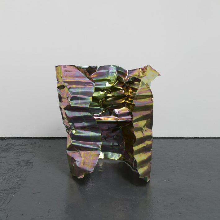
Mirroring the appearance of the roof in the gallery, the body-sized sheets on the floor anchor the installation in the gallery, offering a peripheral path through it. As the viewer stands at the threshold of the memorial, his desire to succumb to the holographic colours, is halted by the realisation of what appears to be reminiscent of an abandoned site. The metal wall-based sculptures ‘Untitled,’ displayed in a separate space of the gallery, are assembled in a patchwork, merged by a rhythmic pattern of rivets to create an impenetrable surface. This surface is interrupted by contrasting elements like air vents and loudspeaker holes suggesting alternative existences.

The project is a continuation of the artist’s investigation into modern day alchemy. The hand-sculpted corrugated steel sheets, damaged and vandalised in their appearance, have been treated by an industrial electroplating process. Each reflective sheet of conductive material has been immersed into twenty different baths. This process prevents metal from corrosion and creates an unpredictable and multi-coloured patina transmuting the base material into a regenerated object. The body of metal has been resurrected with a new skin and its mortality has been changed with the technological process.

Exhibition runs through till May 27th, 2016

Bosse & Baum
Copeland Park
133 Copeland Rd
London
SE15 3SN

www.bosseandbaum.com


R.CRUMB – ART & BEAUTY

Posted on 2016-04-18

Initially published in 1996, the artist recently completed the highly anticipated third volume in the series, and the show marks the largest presentation of the project to date. This is his first solo exhibition in Britain following his 2005 presentation at Whitechapel Gallery.

One of today’s most celebrated illustrators, Crumb helped define the cartoon and punk subcultures of the 1960s and 1970s with comic strips like Fritz the Cat, Mr. Natural, and Keep on Truckin’. The overt eroticism of his work paired with frequent self-deprecation and a free, almost stream-of-consciousness style have solidified his position as a renowned and influential artist, whose work addresses the absurdity of social conventions and political disillusionment.

Combining iconography from comic books, art history, and popular culture, Art & Beauty portrays a broad selection of images of female figures in diverse settings. The inspiration for the series is linked to Crumb’s avid collecting of vintage underground paraphernalia including records, flipbooks, and specifically, Art & Beauty, a catalogue published during the 1920s and 1930s featuring semi-erotic images of life models for art lovers and aspiring painters—an early example of a top-shelf magazine.

Opposite – Untitled, 2015

Exhibition runs through till June 2nd, 2016

David Zwirner
24 Grafton St
London
W1S 4EZ

www.davidzwirner.com


RICHARD PETTIBONE

Posted on 2016-04-18

A fine balance of reverence and criticality is at work in Richard Pettibone’s sculptures, paintings, and photographs. Since the 1960s, Pettibone has painstakingly remade works by other artists on a tiny scale. Like transliterations of epic poems into haikus, his diminutive versions of artworks by historical heavyweights from Piet Mondrian to Andy Warhol are constructed with precision and resonate with care. In combination with their small size, the exacting sensitivity Pettibone brings to his endeavor lends a generous intimacy to the experience of looking at his work.

A Los Angeles native, Pettibone saw Andy Warhol’s first west coast exhibition at Ferus Gallery and Marcel Duchamp’s retrospective at the Pasadena Art Museum. The concepts of repetition and the ready-made as deployed in both artists’ work are upheld with an unwavering conviction in Pettibone’s oeuvre: Aesthetic ideas are taken up as ready-mades to be repeated in multiple versions over time. For this exhibition, a selection of works after Marcel Duchamp and Frank Stella evince Pettibone’s commitment to his craft. By reducing the scale of both iconic and lesser-known works by these canonical artists, Pettibone sets the acts of looking at and making art at the center of his practice.

Opposite – Frank Stella, ‘Clinton Plaza’, 1959, 2011

Exhibition runs through till April 23rd, 2016

Honor Fraser Gallery
2622 S La Cienega Blvd
Los Angeles
CA 90034

www.honorfraser.com


MARIUS BERCEA – (ON) RELATIVELY CALM DISPUTES

Posted on 2016-04-11

For this new body of work, the artist expands his subject matter well beyond the depictions of Romanian landscapes and nostalgic scenes that he is best known for, broadening the scope of investigation recorded onto the canvases to include commentary on the global state of affairs, internal dialogues about authentic identity, and ruminations on the overbearing excess of utopian rationality as expressed through constructed environments. While elements of previous bodies of work still remain integral to this new series, most evidently his use of figures amid architectural features, Bercea allows these paintings to transcend locality.

Informed by the dramatic shift from a longstanding communist rule to a capitalist consumerist system he experienced while growing up in Cluj (located in the Transylvania region of Romania), the paintings on view point to an internalization of the signs and tendencies of two opposing aesthetic regimes. As the disparate dichotomies converge on the canvas, they produce a wholly hybrid territory that moves beyond identification with geographic space. Instead, the paintings act as dialogical platforms where Bercea speaks to the cacophony of contemporary life, where vaguely reminiscent architectural motifs are draped in the tattered vestiges of mid-century modernist ideals, and scenes are overrun with the exuberant entropy of vegetation. Here, Bercea presents a postmodernist Arcadia where a sparse population of nondescript pastoralists commiserate among morose landscapes and overzealous flora. These convoluted signs obfuscate any association with any real locale. It could be anywhere and nowhere.

Exhibition runs through till May 15th, 2016

François Ghebaly
2245 E. Washington Blvd.
Los Angeles
CA 90021

ghebaly.com


SAMUEL JABLON – LIFE IS FINE

Posted on 2016-04-11

Jablon is at once a poet, painter and performance artist; a hybrid. His paintings are vibrant renderings of words abstracted, a kind of visual manifestation of poetry. He appropriates found language — overheard words and familiar phrases, lines of poetry and offhand comments — and transmutes them into compositions. Language disintegrates into letters, which dissolve into line, shape and color.

While, at first glance, the paintings’ textual content often appears legible, this effect reveals itself to be a deception. The paintings demand close consideration and a highly specific mode of looking, one that is neither quite reading nor seeing. As Jablon works, meanings and content metamorphose, other words appear, and differing combinations of layered paint, broken structures, mirrors and pieces of glass confound the possibility of a clean read. Language, in this body of work, appears in a new, deeply transformed light—one that shifts with the viewer’s experience and perception of the words.

The title, Life is Fine, is borrowed from a poem by Langston Hughes. Like the poem, the paintings navigate a messy, ambiguous line that separates the positive and negative experiences of life. Jablon includes the phrase “what a beautiful time” in a number of paintings, and its repetition becomes a type of mantra, as if one must convince oneself that life is indeed fine.

Opposite – Destiny, 2016

Exhibition runs through till May 15th, 2016

Freight + Volume
97 Allen Street
New York
NY 10002

www.freightandvolume.com


MATTHEW CHAMBERS

Posted on 2016-04-11

In his new exhibition, Chambers is presenting a series of large scale floral paintings. These paintings are distinguished by vibrancy and saturation of color, emphasized by an unusual materialism. Although the color blocking and general shapes add up to a recognizable figurative image of flowers, the paintings cannot be described as “still lifes” or “color field paintings”.

At the core of Chambers’ practice is the process itself, the act of ‘art-making’, rather than the finished ‘artistic product’. His work is characterized by a unified size canvas rather than content or style, allowing the spectator to make comparisons between the pieces, series, years, and decisions made.

Opposite – Hulot, 2016

Exhibition runs through till May 14th, 2016

Hezi Cohen Gallery
54 Wolfson Street
66042 Tel Aviv
Israel

www.hezicohengallery.com