IAN SCOTT – SPRAYED STRIPES AND NEW LATTICES

Posted on 2017-06-12

New exhibition exploring the works from the New Zealand painter Ian Christopher Scott (20 April 1945 – 27 June 2013). From the late 1960s, his work was significant for pursuing an international scope and vision within a local context previously dominated by regionalist and national concerns. Over the course of his career he consistently sought to push his work towards new possibilities for painting, in the process moving between abstraction and representation, and using controversial themes and approaches, while maintaining a highly personal and recognisable style

Opposite – Small Lattice No. 429, 2012

Exhibition runs through to June 17th, 2017

Michael Lett
312 Karangahape Road, Cnr K Rd & East St
PO Box 68287 Newton
1145 Auckland
New Zealand

michaellett.com


ELVIS ALMEIDA – TWISTED DRY EDGE / BLUNT KNIFE

Posted on 2017-06-12

Elvis de Almeida’s Ponta Seca Torta / Faca Cega [Twisted Dry Edge / Blunt Knife] presents twelve paintings of different sizes. Using a palette of electric colors and a well-defined visual vocabulary, Elvis occupies a singular position in the Brazilian contemporary production. He always tries to be placed in a situation of instability in his process. Without projects, sketches nor models, this strategy allows him to search for solutions as he carries on with his work. He uses oil, acrylic, spray paint, vinyl paint, enamel, highlighter, graffiti, charcoal, among other materials. Elvis faces each material choice as a game proposition, in which each decision triggers new deadlocks and their solutions represent the conclusion of the work.
Since he has a B.A. in Printing from Escola de Belas Artes – UFRJ, the artist translated that technique into painting. Many elements in his works are “printed” on canvas and wood using instruments he created himself out of sponge. His work assembles graffiti and cartoon elements, translated and agglutinated in saturated contrasting colors. His visual vocabulary is supported, on the one hand, by physical forms – sun, ray, flame, drop, leaves, molecules – and, on the other, by architecture through geometric patterns either striped or circular, many of which depicting memories from real places. These two sets are in constant conflict in pieces full of friction and spark.

Exhibition runs through to July 29th, 2017

Fortes D’Aloia & Gabriel
Galpão
Rua James Holland 71
01138-000 São Paulo
Brazil

www.fdag.com.br


NICOLAS PARTY – THREE SEASONS

Posted on 2017-06-05

Swiss artist Nicolas Party has executed two site-specific murals that transform the interior while creating a singular environment for a recent group of large-scale pictures and bronze sculptures. Working exclusively in vivid, highly-pigmented chalk pastels – either directly on the walls or primed canvases – Party invites us to rediscover this once popular but now often neglected medium. Respectful of the traditions that precede him on the one hand, but radically extending them on the other, the artist’s handling of the medium is anything but academic. Here, all associations with drawing, delicacy and fragility have been supplanted by a fresh, graphic sensibility and a technique more akin to painting. Unlike paint, however, pastels are blended directly upon the support: a task that requires great exactitude and foresight.

While the popularity of pastels has waxed and waned over the centuries, their physical properties remain unchanged. From a seventeenth-century portrait to an Impressionist landscape, up to and including Party’s contemporary iterations, works in pastel are distinguished by a single unique quality: their luminosity. The velvety, seductive glow is caused by the myriad facets of loosely bound mineral powder scattering and diffusing light across the surface of the work. But whereas pastels were historically prized for the life-like flush they lent to portraits, or utilised for their ability to convey atmosphere and mood, Party veers in completely the opposite direction and uses them to create a coruscating artificiality. The intense colours are also specific to the medium, which is manufactured from a surprisingly small range of pigments (typically those used for oil paints) and different amounts of filler. This allows the production of innumerable tints with only the subtlest of variations. Party can consequently work in gradations of tone rather than in colour mixtures, thereby attaining a dazzling brilliance.

Exhibition runs through to July 15th, 2017

Xavier Hufkens
107 rue St-Georges | St-Jorisstraat
B – 1050 Brussels
Belgium

www.xavierhufkens.com


THOMAS SCHUTTE

Posted on 2017-06-05

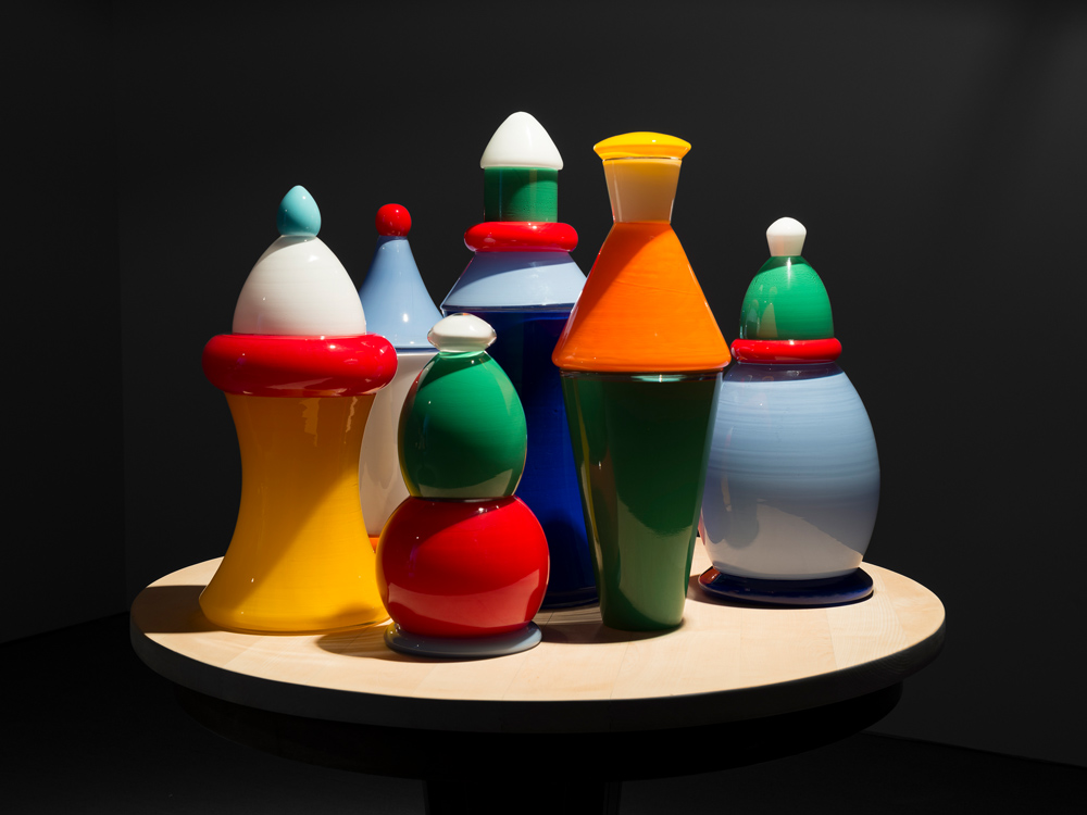
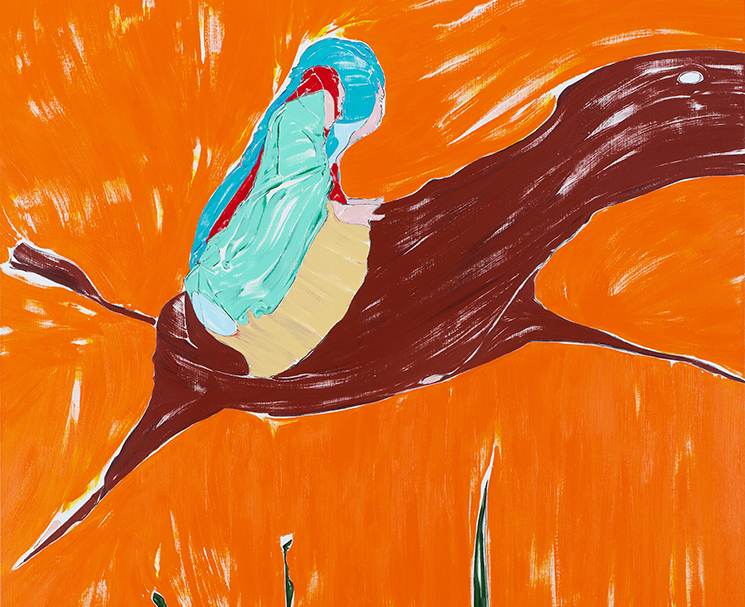
Approaching his practice as a “seismograph” of the world around him, Schütte deals in ambiguity and paradox. His sculptures, architectural models, watercolors, and photographs, which have transformed in scale and medium over the last 40 years, repeatedly return to certain motifs. Within this realm, there is one concept that is invariably applied to Schütte’s work regardless of subject matter or material: his sharp observation and interpretation of the human condition. For this exhibition of work created over the last six years, Schütte revisits familiar themes, including human countenances, groupings of figures, and architectural studies. Unrestricted by medium or dimensions, his pieces are rendered in steel, Murano glass, bronze, and ceramic, in forms ranging from small tabletop models to woodcuts to looming sculptures. In this selection, Schütte directs his attention towards the otherness of the face and the body: whether as authoritative grotesques or modernist abstractions, he navigates reductions in form to achieve studies that are fragmented, silent and singular, even when presented in groups. What ultimately remains is the essence of the figure as a reflection of some perceived characteristic only the artist is privy to. There is always a touch of tenderness in the grotesque, strength in the vulnerable, and humor in the monstrous. What is startling, and at the same time reassuring, is that the work doesn’t mirror life in the black and white terms of contemporary pop culture imagery. Rather, Schütte’s work strikes a harmonious balance between the nuances of our precarious reality and the figures that he has shaped as a reflection of our existence within it.

Opposite – Gartenzwerge (Glas), 2017

Exhibition runs through to June 7th, 2017

Carlier / Gebauer
Markgrafenstraße 67
D-10969 Berlin
Germany

www.carliergebauer.com


NICOLA TYSON – A TENDENCY TO FLOCK

Posted on 2017-06-05

Adopting an intuitive approach, Tyson begins by drawing. She works quickly to “stay ahead of rational decision making”, not knowing what will appear but trusting that the “discovered” images will resonate with a complex range of meanings and associations. Selected sketches are then worked up into paintings through a slower, more deliberate process. Tyson’s expressive paint application is nevertheless characterised by a ‘one-chance only’ approach – that of using a dry brush to produce a sense of immediacy and dynamism of movement, in addition to her chromatically-heightened pallet of unlikely colour combinations, alternately perverse and beautiful.

Tyson draws influence from artists such as Bellmer, Bacon, Bourgeois and sources beyond, reformulating these precursors in the pursuit of an independent and idiosyncratic visual language. Her approach to her medium, and to the genre of figuration, has been compared with that of the pioneering Austrian painter, Maria Lassnig (1919-2014), who coined the terms Körpergefühl (body sensation) and Körperbewusstsein (body awareness) to describe her own approach. These twin concepts aptly reflect the combination of physicality and introspection which informs Tyson’s work. Her ambivalence about titling her works (often preferring numbers or minimal annotations) reflects her reluctance to guide the viewer towards any specific reading. She has stated: “for me, a successful drawing or painting is one that I don’t recognise… that surprises me”. Accordingly, the title of the exhibition — A Tendency to Flock — references nothing specific, save an urge to gather together. Like the paintings, the title elicits a gentle yet absurd humour.

Exhibition runs from June 22nd through August 19th, 2017

Sadie Coles
1 Davies Street
W1K 3DB
London

www.sadiecoles.com


DANIEL BUREN

Posted on 2017-05-29

In his over 50-year career, Daniel Buren is best known for his use of contrasting stripes as a visual tool that reveals the specific features and dimensions of a site, often transforming the environment for which it was specifically designed. He alters the perception and context of one’s surroundings by modifying the navigation of space, enhancing lighting, obstructing viewpoints, and highlighting certain architectural features. Buren constructs his work—much of which is temporary—in the architecture of both public and private spaces ranging from subway platforms to museums.
Work in situ – “denotes a work made for a particular site, for a particular time and exhibited in this particular site, and therefore not transportable to another place.” Buren has also identified himself as an artist who “lives and works in situ.” Situated work – “a work for the most part inspired by a particular location, but made with the intention that the very same elements of the original work can be reinstalled in different sites following a series of rules, changing each time in response to the given place. In turn, the site is changed by the work.”
Visual tool – the sign of white and color alternating stripes of exactly 8.7 cm. in width, as derived from the fabric he first used as a canvas in 1965. This functions as a tool in Buren’s work, as a standard or unit of measure of formal properties. Significantly, it is also an intended sign that serves as a constant within the wildly variable parameters and juxtapositions of any and all in situ and situated work since 1965 without exception.

Exhibition runs through to June 24th, 2017

Bortolami Gallery
39 Walker Street
NY 10013
New York

bortolamigallery.com