ANA MENDIETA – CUBA & MIAMI, 1981-83

Posted on 2018-09-17

Often referring to being “torn” from her homeland, Mendieta persistently sought to connect with her origins and the Cuba she left as a child. Mendieta’s return to Cuba as an adult and fully formed artist deeply influenced her perspective and approach to artmaking. Almost 40 years later, a selection of these works will be on view in Paris for the first time.

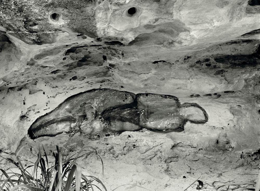
The exhibition features works made in Miami, symbolically and physically the closest geographic point to Cuba. Finding affinity to Miami’s shores, she often visited and created a number of works in the landscape, notably, the Sandwoman (1983) series. A rare recreation of the original installation, which anticipated her subsequent sculptures made from earth and wood, as well as several Sandwoman photographs. Ochún (1981), a photograph of a work that Mendieta also documented on video, was titled after the patron saint of Cuba and Afro-Cuban deity who possesses the power to create unity. Two curved ridges of sand symbolize the United States and Cuba, unified by the same water, which then flows between them. Displacement and unity, two abiding themes for Mendieta, are clearly present throughout this body of work and the exhibition.

Opposite – La Venus Negra (The Black Venus), 1981 / 2018

Exhibition runs through to November 17th, 2018

Galerie Lelong & Co.
13, rue de Téhéran
75008 Paris
France

www.galerie-lelong.com


KEENAN DERBY – WAVEFORMS

Posted on 2018-09-17

This series of paintings was inspired by a 17th century ceramic tile depicting the expedition of a Dutch whaling party, which Derby found in “Secrets of the Sea”, a 1971 copy of Reader’s Digest. “I was immediately drawn to the luminous blues and whites, and the complex and elegant lines tracing ships, waves, and whalers.” The tile’s lines serve as the foundation of Derby’s paintings, moving in and out of focus as he adds thick, shimmering, coats of acrylic and sand. “The work is finished when the layers of opacity begin to glow with an inner light, and the paint functions on its own terms.”

In addition to cool, rocky, ocean waves, Derby is inspired by the warm, hazy, vistas of Southern California. These paintings hug the surface close, lines of paint seeping into an ochre desert of raw linen. Just as the mast of a ship might appear, bobbing, in the thick paintings, here cacti and ancient pines glimmer, like a mirage, within the flat weave of the surface. “Flanking perception and invention, a finished work is a moment cast in stone, a flawed memory solidified into reality, asserting its own place in the world.”

Opposite – Descending Branch, 2016

Exhibition runs through to October 13th, 2018

Craig Krull Gallery
2525 Michigan Avenue
Building B-3
Los Angeles
90404 CA

craigkrullgallery.com


JUDITH EISLER – RIFFS. JARMAN’S CARAVAGGIO

Posted on 2018-09-10

Judith Eisler paints cinematic close-ups sourced from her own photographs of paused film scenes. With a lifelong interest in film, Eisler often returns to the work of filmmakers such as Rainer Werner Fassbinder and Derek Jarman. In consideration of the formal properties of light, color and space within a single film frame, the artist considers an image’s capacity to exist as both real and fictional. As each image undergoes multiple layers of mediation, Eisler’s renderings shift between representational and abstract. Working with oil on canvas, Eisler directs our view to the visual optics of cinematic happenings.
The film “Caravaggio” depicts the story of Michelangelo Merisi da Caravaggio’s (1571 – 1610) life, filtered through the lens of filmmaker Derek Jarman (1942 – 1994). The script expands upon the sanctioned narratives of what might have occurred. If the film is at all biographical, it is in Jarman’s fidelity to the color, light and tableaus of Caravaggio’s paintings. Jarman either recreates or refers to a number of Caravaggio’s paintings such as Boy with a Basket of Fruit (1593), The Lute Player (1596), Penitent Magdalene (1594-95), and The Deposition (1602-03). The actors and sets are staged and illuminated in a visual style that echoes the dramatic light infusing Caravaggio’s paintings.

Opposite – Palette, 2017

Exhibition runs through to October 20th, 2018

Casey Kaplan
121 West 27th Street
10001
New York

caseykaplangallery.com


HAROLD ANCART – FREEZE

Posted on 2018-09-10

Ancart began painting icebergs in January 2018 in response to a glacial winter in New York, where the artist is based. These new works will be on view in Freeze, Ancart’s first exhibition in the United Kingdom as well as his first presentation at the gallery. The title of the exhibition refers not only to cold temperature but also to the command not to move.

Ancart paints subjects that naturally invite contemplation such as the horizon, clouds, flowers, or flames. Mankind has gathered around a flickering flame for millennia, weaving stories and creating myth, while the flame generates faces and figures as it moves. Clouds, mountains, and icebergs function in the same anthropomorphic way. According to the artist, they carry many faces and tell many stories.

The subject matter of the iceberg is consistent throughout the exhibition. The only other recurrent element that unites the paintings is the horizon line that slices through each work, dividing sky and sea, foreground and background. This device dissects the painting from a figurative whole into abstract parts; subject concedes to form, color, and gesture; these works are a meditation on painting.

Opposite – Untitled, 2018

Exhibition runs through to September 22nd, 2018

David Zwirner
24 Grafton Street
W1S 4EZ
London

www.davidzwirner.com


MADSAKI – FRENCH FRIES WITH MAYO

Posted on 2018-09-04

While much of MADSAKI’s work centers on his interest in art history and critiquing mass culture with references to slang, movies and manga characters, the artist has recently been exploring more personal, intimate topics. To express this visually, MADSAKI developed a signature style using spray paint as a fine art medium, stemming from the fact that he has never participated in illegal graffiti on the streets. The artist is particularly known for his Wannabe series, which at first glance humorously targets old masters, yet their deeper meaning is a reoccurring theme that can be found throughout MADSAKI’s artistic practice – an attempt to use laughter and humor as both distraction and therapy for his internal turmoil.

Opposite – Installation view

Exhibition runs through to September 22nd, 2018

Perrotin
76 rue de Turenne
75003 Paris
France

www.perrotin.com


DANIEL RICHTER – I SHOULD HAVE KNOWN BETTER

Posted on 2018-09-03

This group of large-scale oil paintings constitutes the next experimental step in a visual language which the artist has developed throughout his career. Since his formative years in Berlin as an assistant to Albert Oehlen, Richter’s paintings have synthesised art history, mass media, politics, sex and contemporary culture into ever-changing pictorial worlds.
Richter’s current style, which oscillates between figuration and abstraction, represents a radical departure from his former approach to painting, both in terms of subject and form. Lines of crayon-oil contour patches of colour to reveal body-like shapes in seemingly pornographic poses: spread legs, arched backs, grasping hands and wide-open mouths can be deciphered. Richter explains: “My concern is with the surface, this flat, tangled, never-changing scheme of figure constellations, in and out”. The figures seem to levitate and collide. The cannibalising shapes convey a sense of abstraction, which is reinforced by the background’s subtle gradations of colours.

Opposite – They thenmen took over then, 2018

Exhibition runs through to September 28th, 2018

Galerie Thaddaeus Ropac
Ely House
37 Dover Street
W1S 4NJ London

www.ropac.net