MATTHEW STONE – LOVE FOCUSED LIKE A LASER

Posted on 2012-11-26

Love Focused Like a Laser highlights a new series of wall-based works created using computer controlled engraving and a new form of photography that captures moving bodies lit only with lasers. During the long exposure shots, Stone moves in front of the camera and “draws” directly with nightclub lasers lights onto the bodies of the performing figures. The camera tracks the movement of the models, the artist and the lasers resulting in spectacular imagery that combines photography, performance and drawing.

These pieces are part of Stone’s continuing explorations of the body and spirituality in our contemporary experience, promoting an optimistic reimagining of human potential. They push his explorations forward via his creation of luminous creatures and spectral bodies that emerge from a process that is defined by community-minded collaboration and embedded within the technological language of our times. Inspired in equal part by shamanism and avant-garde nightlife activity, Stone gives image to his philosophy that the nightclub might present a secular context for sublimated and intuitive religious experience, a statement that is reasserted in the works’ installation.

Exhibition runs through to December 31st, 2012

The Hole
312 Bowery Street
New York
10012

theholenyc.com


STANLEY WHITNEY – YELLOW, NOON AND NIGHT

Posted on 2012-11-26

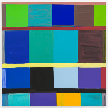
The title of the exhibition, which is also the title of one of Whitney’s paintings, is, like most of his paintings, inspired by music, poetry and his love of reading: In this case by a blues song called Morning, Noon and Night. For the title Stanley Whitney simply replaced the word “Morning” with “Yellow” to introduce the aspect of colour. And the title also emphasises rhythm as a parameter that is essential to Whitney’s work: Whereas rhythm is central to Jazz and Blues, it is the colour that makes the beat in Whitney’s paintings.

Colour is what structures the paintings. For a long time Whitney has been working with square canvasses of different sizes, which he structures with up to four unequal bands consisting of one or more lines the width of a paintbrush. Starting from the top left–almost like writing a text–he fills the bands with a series of non-uniform rectangles and squares of different colour. This process, which ends at the bottom right of the canvas, can be repeated two or three times. The choice of colour is intuitive and the result of the painting process which is unpredictable an unknown.

Whitney works with the system of “call-and-response”, which is a principle used across multiple disciplines, and in music is typical in spirituals, gospels, blues and jazz. He paints one colour and then decides which colour responds to the first one. This very simple principle results in the fact that the same colour is almost never used twice and the colours become more and more complex.

Opposite – This Side of Blue, 2011

Exhibition runs through to January 12th, 2013

Galerie Nordenhake
Lindenstrasse 34
D – 10969
Berlin

www.nordenhake.com


JOHN BARTLETT – LONDON SUBLIME

Posted on 2012-11-26

John Bartlett’s extraordinary narrative paintings are fixated on the paranoia of modern urban life. This major mid-career show includes the artist’s large-scale canvasses alongside more intimate, everyday scenes which capture contemporary London in all its messed up glory.

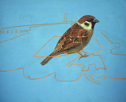
Bartlett revisits and adapts traditional genres of painting to evoke the world we live in today. Throughout the exhibition he will be creating a large wall drawing on the subject of the August 2011 riots entitled ‘Rise of the Invisible’. This new work will echo the monumental ‘History Painting’, a depiction of the Poll Tax Riots currently on display at the Museum of London.

Opposite – 36 Vanishing Points, 2003-5

Exhibition runs through to January 20th, 2013

Guildhall Art Gallery
Guildhall Yard
London
EC2V 5AE

www.cityoflondon.gov.uk


JIL SANDER SQUARE TOE SHOES

Posted on 2012-11-26

For Spring/Summer 2013, Jil Sander unveils dual colorways of the staple Square Toe shoe. Presented in either maroon or olive with strong color blocking, each has black accents and prominent snub-nosed front as well as red stitching along the sole for a unexpected twist.

jilsander.com


AKOMPLICE X RICKY POWELL HAT COLLECTION

Posted on 2012-11-26

The collection is comprised of pom beanies in black and red as well as a trio of snap backs in hunter green, maroon and navy. Each hat features our logo alongside Ricky’s signature and the number 50 illuminating the inclusion of this collection within Ricky’s 50th anniversary.

More than a collection of hats, this is a collaborative effort which will reverberate with New Yorkers. For the collection we made use of the iconic New York Times typeface and added our own street savvy spin. In line with Ricky’s artistic appetite, we enlisted a threesome of topless models who were more than willing to bare their bodies for Ricky’s lens. Along with the digital look book, a curated collection of physical prints will be on display at our flagship Saturday, November 17th with Ricky Powell in attendance. We will be offering a pre-release of the hats the night of the event. The hats will be available at fine Akomplice retailers worldwide on November 26th.

www.akomplice-clothing.com


THE WEIR OVERLOOK SPECIAL EDITION KNIT HAT

Posted on 2012-11-26

The Connoisseur brand is all about immersing itself in the things we love and are passionate about, this is no finer example of that.

This is one of a kind, if you don’t know what this is or represents then, well, you shouldn’t have to ask. But if you must; it’s that horrendous, garish carpet from the Overlook Hotel, from the chilling cult Stanley Kubrick movie The Shining. Come and play with us, forever and ever and ever…

casualco.com